|
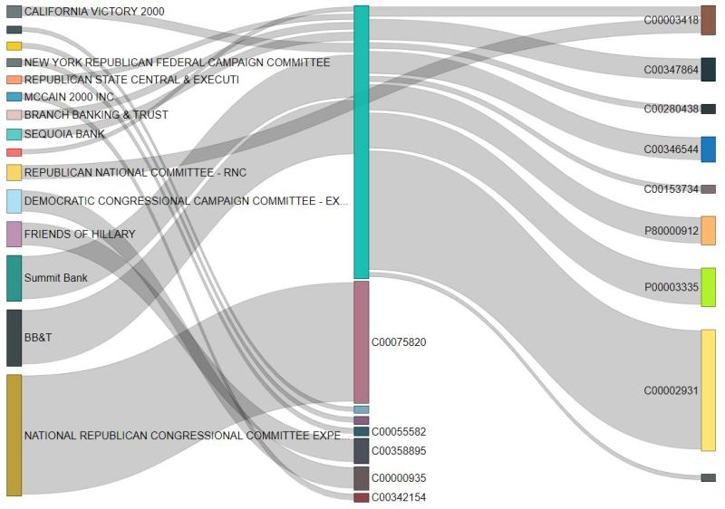
Creating visualizations of relationships within data sets can be challenging for even the most experienced data scientist. One great tool is the Sankey diagram that shows the strengths of relationships between multiple parties. Building on the Campaign Finance Data set I created, this diagram shows the flow of funds between political entities in 2018. To keep the diagram as simple as possible, this shows transactions of $1MM or more.
I intentionally did not label the recipients of the funds to avoid any heated discussions. However, its fairly clear that some groups are the true influencers of others but remain hidden from public view. By understanding the true flow of money through the system we can identify who the real power players are. What do you think will happen during this cycle?
1 Comment
|
AuthorSid Ghatak is the Chief Data Officer at Increase Alpha and lives at the intersection of the customer, business, and technology. Email him at [email protected] or follow him on Twitter to get insights on your world. ArchivesCategories |

 RSS Feed