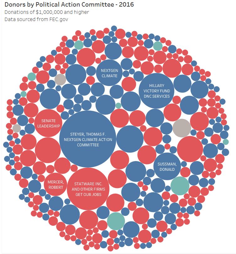
 As we enter another political cycle with the inevitable bombardment of ads, I wanted to know who was really influencing what we see and hear. In the USA this data is available for all of us to examine. However, actually taking the time to examine it is not something everyone can do, so I thought it might be helpful to start applying my skills to disseminate this information.
This is my first post of a series that I am developing that will attempt to show the flow of money into and out of our political system. All of the data has been sourced from FEC.gov and has not been manipulated in any way. The visualizations I have created show individual contributions of $1,000,000 and more. Donors can be either individuals or entities, the recipients are PACs. What I found interesting is that extremely large donations occur for both parties and that there are a few individuals and families who donate enormous amounts. Take a look and let me know what you would like to see next! Follow me to see more, I plan on posting several times a week as I have A LOT OF DATA! Click here for the interactive visual.
1 Comment
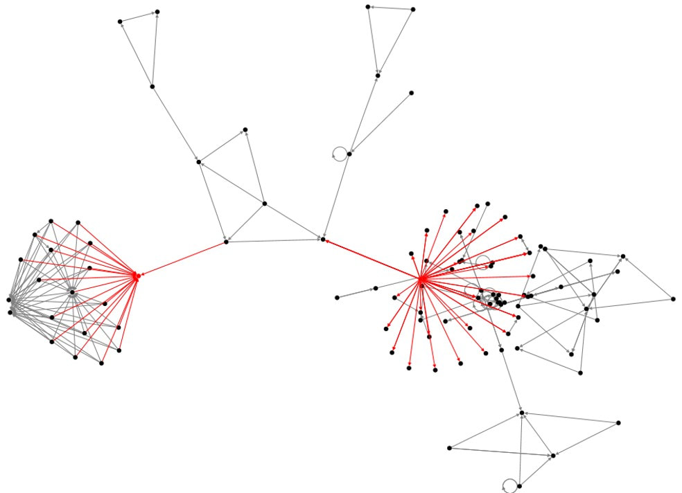 We all know that social media can be an extremely cost effective method of marketing. However, in order for it to be effective, its critical to find those that truly have influence over the issues that you are promoting. That's where social network diagrams like the one below play a critical role. Being able to quickly visualize your network and then identify those that have the most influence will enable you to reach out to them with targeted messages that they are likely to respond to. Static images are not sufficient for this analysis, its critical to be able to interact with the data and try different visuals. This image shows the last 50 tweets for hashtag#Election2020. Notice the two dots highlighted in red, these are the key influencers with significant reach.
Do you know who your influencers are? 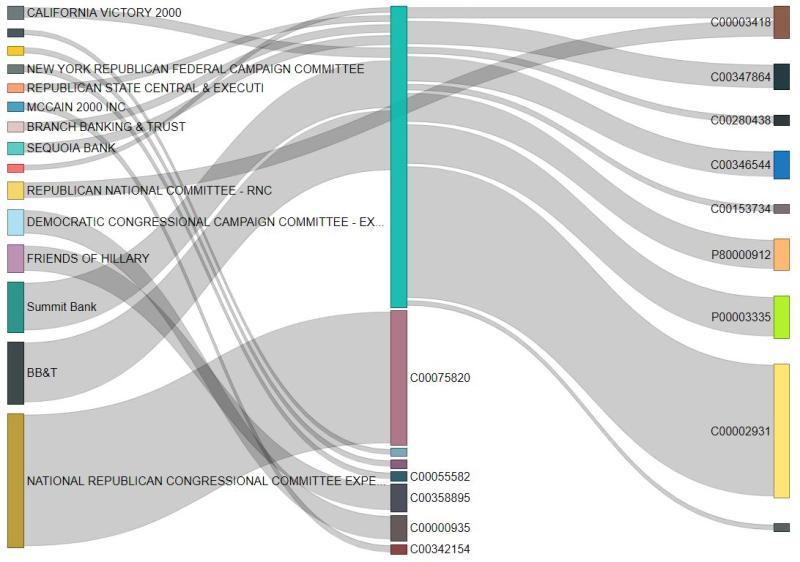 Creating visualizations of relationships within data sets can be challenging for even the most experienced data scientist. One great tool is the Sankey diagram that shows the strengths of relationships between multiple parties. Building on the Campaign Finance Data set I created, this diagram shows the flow of funds between political entities in 2018. To keep the diagram as simple as possible, this shows transactions of $1MM or more.
I intentionally did not label the recipients of the funds to avoid any heated discussions. However, its fairly clear that some groups are the true influencers of others but remain hidden from public view. By understanding the true flow of money through the system we can identify who the real power players are. What do you think will happen during this cycle? 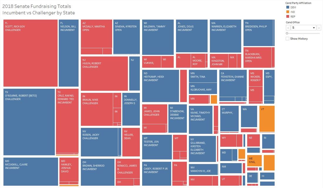 If we could bet on politics an extremely safe one would be betting that incumbent Senators would win re-election. According to OpenSecrets, since 1964 the average re-election rate for the Senate has been higher than 82%. That's a safe bet.
Why? Incumbents have a massive advantage in fundraising over their challengers. The analysis below shows that in 2018, outside of a few high profile races, the incumbent had raised substantially more than their challenger. However, there is hope in that in 3 of the 5 biggest races (Florida, Indiana, and Nevada) the challenger had raised more than the incumbent and won the seat. Of particular interest was Arizona where the seat was open and the amount of funds raised were approximately equal between the two parties. Want to interact with the data? Click here. |
AuthorSid Ghatak is the Chief Data Officer at Increase Alpha and lives at the intersection of the customer, business, and technology. Email him at [email protected] or follow him on Twitter to get insights on your world. ArchivesCategories |
 RSS Feed