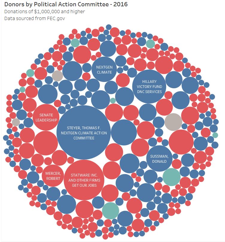
 As we enter another political cycle with the inevitable bombardment of ads, I wanted to know who was really influencing what we see and hear. In the USA this data is available for all of us to examine. However, actually taking the time to examine it is not something everyone can do, so I thought it might be helpful to start applying my skills to disseminate this information.
This is my first post of a series that I am developing that will attempt to show the flow of money into and out of our political system. All of the data has been sourced from FEC.gov and has not been manipulated in any way. The visualizations I have created show individual contributions of $1,000,000 and more. Donors can be either individuals or entities, the recipients are PACs. What I found interesting is that extremely large donations occur for both parties and that there are a few individuals and families who donate enormous amounts. Take a look and let me know what you would like to see next! Follow me to see more, I plan on posting several times a week as I have A LOT OF DATA! Click here for the interactive visual.
1 Comment
|
AuthorSid Ghatak is the Chief Data Officer at Increase Alpha and lives at the intersection of the customer, business, and technology. Email him at [email protected] or follow him on Twitter to get insights on your world. ArchivesCategories |
 RSS Feed